A Tale from the Scrap Bin
Even though you may feel like a bit of pack rat, sometimes hanging on to that little scrap of something turns out to be a good thing!
As Pennsic is approaching once again, I don’t have a lot of projects to complete, but I have a sari that I got many years ago and have never used that I’ve decided to turn into a fancy peplos (also commonly known as a “Bog dress”). This is a type of garment commonly worn by women in ancient Greece and Rome, and in many other cultures of the early Middle Ages as well. While I have some other linen peploi that I typically wear by themselves, this one I decided I wanted to pair with an undergarment so I wouldn’t feel quite so bare underneath.
I found a nice light cotton with some patterned detail on sale at my local fabric store that was wide enough to fold lengthwise and go comfortably around me. I machine-stitched the side seam and then hand-rolled the raw edges of the top and bottom to finish them off.
But what to do for the shoulders? Typically, I pin my peploi at the shoulders using different fibulae (historic safety pins), but since this is intended as an undergarment, I didn’t want to add too much bulk. After some thought, I remembered that I had a bit of trim (about 18″) left over from a previous project and so I cut two lengths of about three inches, pressed them to a point at each end, and then sewed the trim over the points where I would usually pin at the shoulders. Presto! A neat, non-bulky, and decorative way to hold this garment at the shoulders. Hooray for the (small) box of scrap trim!

Double Scroll Update
Last week was the big winter event in our local area – the St. Valentine’s Day Massacre. This event usually has a big court since it’s well-attended and this year was no exception, so I ended up doing two scrolls.
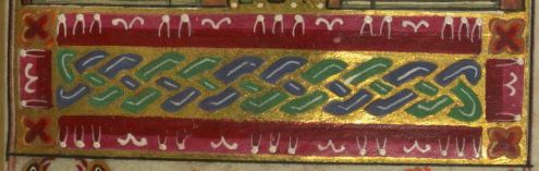
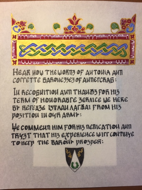
The first was an award of arms, and for this I did #2 in the “paper towel” inspired series.
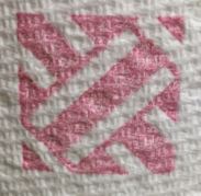

I didn’t end up with as much of the basket weave look in my finished piece, so I might use this one again and perhaps vary the spacing a bit so that the bands are closer together and create a little more of an overlap.
Still, I like the contrast of the colored bands and black filler. Once again, the gold dots really give the whole thing a more cohesive appearance.
We also saw a baronial transition at the event and it is typical in the SCA for the outgoing baron/esses to be awarded a court barony as a sign of their service and dedication. I had asked our regional signet a few months ago if I could lay claim to doing the scroll for one of the outgoing baronesses (we had a mother-daughter pair) who I greatly admire.
I had some ideas in mind, particularly some ways to incorporate some of the recipient’s heraldry – the three bumblebees representing her three daughters. In my previous obsession with Trinity MS R.17.1, I noticed that many of the letters had flowers that looked like they could easily be converted into bees, so that’s exactly what I did!
 Ultimately, I combined elements of several manuscripts here. The large initial letter is based on the left initial from f.240r and the flowers that became bees are found in many of the letters overall (you can see one in the next initial on the same page).
I used gold leaf over Miniatum ink for the gilded areas on the letter but then I got a little out of sequence and also didn’t want to fuss with the tiny areas of gold on the bees, so ended up doing those with Holbein pearl gold gouache.
As you can also see, this is another 12th century style scroll with the introductory line done in big colorful letters. I’ve done a few of these in the past six months or so, but they’re just so fun!

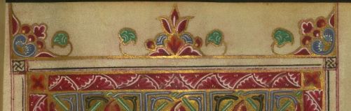
I did plan ahead somewhat for this scroll and decided to fill in the lines at the ends of paragraphs – and the start of the next paragraph – with some decorative details inspired by borders from the St. Alban’s Psalter, another 12th century English manuscript. This book has a ton of amazing borders around the large illuminated pages, so it’s a gold mine for scribes! The ones I used here are mainly the simpler borders from pages 69, 70, and 71.


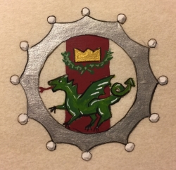
The finishing touch was the kingdom seal. Once again, I went the route of a tiny dragon and I wanted to include the silver coronet of the court barony award in the design. I decided to put the kingdom’s device inside the coronet, which let me include the 12-pointed coronet awarded to those who are previous landed baron/esses without having to worry about drawing the form in perspective and trying to get in all 12 points!
 I found a schematic of a circle divided into 12 sections, but ultimately I just used my template to make two circles – one for the inner ring and one for the points and then eyeballed the divisions for 12 points and tried not to worry too much about making them exactly even!
The silver of the coronet is silver gouache over a grey base layer, though I’m not sure that was really needed here. I usually do a golden-yellow base layer under metallic gold gouache, just in case the gold is a little thin in spots, but I was really happy with the way this silver covered!
I freehanded little circles for the pearls and just filled them in with Permanent White and a tiny touch of grey on the curves to give a sense of shape. I’m really pleased with the way this turned out overall!
And finally, the finished product! This is done on an 11×14″ sheet of heavyweight Pergamenata. natural color. The margin is 1 1/4″ with a one inch division in the center. Paints are Winsor & Newton Designer’s Gouache with Holbein Pearl Gold. The silver was given to me by a fellow scribe, so I don’t know the brand (though I’m going to find out).
A Smaller Scroll
Smaller, but not less significant! Sometimes it seems like scrolls that are small in size get a little underrated because they’re not as large as others, but a little work can make a small scroll look quite nice!
A few months ago, one of my baronesses asked me about doing a “release from service” scroll for an individual in our barony who has reached a level of health that means he can no longer fight in armored combat. The gentleman has been a stalwart member of the barony’s fighting force for many years, and the baronesses wanted to give him appropriate recognition for his service.
The person receiving this scroll has a Hungarian persona, so I looked around for manuscripts from that general region and settled on one from the Walters Art Museum in Baltimore.
MS W.547 was produced in Constantinople in 1678, which means the actual manuscript is outside of the SCA’s time period. However, there are other manuscripts with the same style of illumination that were produced within the time frame of the SCA such as the Gladzor Gospels produced 14th century.
While both of these manuscripts are Armenian in origin, there are a relatively low number of Hungarian manuscripts that survive to the present day, and those that do tend to follow the prevailing style of their times, so it’s reasonable to expect that manuscripts from the 14th century would do the same.
I combined elements of two different pages for my scroll – a top element from folio 3r:
 And a boxed header design from folio 260r:
 The text is a faux Cyrillic script taken from the An Tir College of Scribes Award Charter Guidebook (this resource has a number of hands designed to emulate the look of foreign text while still being written in English).
The finished product is done on a small piece of Pergamenata I had on hand, about 6×8 inches. Paint is Winsor & Newton Designer’s Gouache and Holbein Pearl Gold.
I’m actually pretty happy with the way the gold turned out on this. As usual, I laid down a layer of golden-yellow gouache as an underlayment for the metallic paint. This helps hide any areas that might be a little thin. I had originally thought about doing two layers of gold but I was ultimately satisfied with one.
I like the whitework I did on this as well. While the white wash over the red did want to bring up some of the red color, that helped mitigate the brightness of the white somewhat. Letting the paint dry slightly gave me a thicker texture for the small details afterward.
Taking Inspiration Where You Find It
A few weeks ago I received my latest scroll assignment and I was taking my time thinking about what style I wanted to use. Then, I opened up a new roll of paper towel.
Seriously.
I started looking at the designs on the towels, and it just popped into my head that some of them would make a great basis for border designs.


While this might seem like a strange place to find inspiration for a scroll, there are many examples of geometric patterns like this being used in borders, especially in the 11th and 12th centuries.
So away I went, using the quatrefoil design as the basis for my pattern. I just followed the vision I had in my mind for color, and I rather like the way it turned out. The gold outline is Holbein Pearl Gold gouache, and I like the way it stands out against the black surroundings.
The overall scroll is about 9×7″ and the circle of the Purple Fret is 1″ in diameter. I think what I like best here are the tiny gold dots on the black background. Those weren’t part of my original plan, but they really make the whole piece pop.
I may have more paper towel inspired designs yet to come!
New Post for the New Year
Even though I finished this weaving a while ago, I’m just now getting around to posting it here, mainly because I’ve been lazy about writing.
This band is another approach to the pick-up weaving technique that involves some more complicated manipulation for the edges. The pattern comes from this site, whose author has produced a large number of patterns for a wide variety of different types of weaving. It’s all in Norwegian, so Google Translate will come in handy at times!

While traditionally this type of weaving was done with white linen and red wool, modern patterns allow for a much wider variety of color combinations, and I put together colors that appealed to me from what I had on hand.
The center pattern is done with size 10 crochet thread for the green and size 3 for the off white pattern threads. The borders are done entirely with size 10 thread and are also done using pick-up, which was a learning process for me to start. It especially makes a big difference here to make sure that the border pattern is in sync with the center pattern in terms of which shed is on top (heddled or unheddled). The other discovery was having to expand my pattern until the repeat of the border and the repeat of the center synced up. This made for a rather long pattern!
I like the way this turned out. The color combination is appealing to me and I like the double-sided nature of this technique.
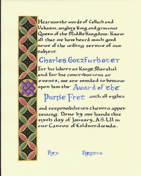
A Big Deal Scroll
Back in May I got a call from a friend asking if I’d be able to do something I hadn’t yet done in the SCA – make a peerage scroll. I was a little surprised and had to say that I couldn’t take the commission right away because it was only a couple of weeks before the event where the elevation was to take place and my modern workload didn’t leave me the time to work on a major scroll like this.
Happily, this wasn’t an issue – many peers commission their scrolls after elevation – and I was able to do the job after the event had actually taken place.
After some time (and Pennsic) went by, I set myself the deadline of Grand Day of Tournaments to have the scroll completed. I had hoped that the king who was on the throne at the time of the elevation would be there to sign it, but that didn’t work out.
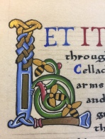
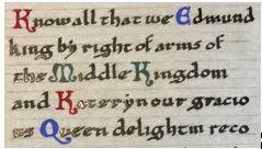
So, this is a knighting scroll, my first ever! The recipient uses a 12th century persona, and conveniently I had recently been looking at the initial letters from a great manuscript of that era, in the collection of the library of Trinity College, Cambridge.
The manuscript is known as the Canterbury Psalter and dates to about 1150. It comes from Christ Church, Canterbury and is made up of 285 pages, written front and back on vellum.
Many of the pages have large, colorful illustrations done in red, green, and blue inks while others are decorated with large illuminated letters among the blocks of text with smaller letters done in gold to start each sentence. When I found this manuscript over the summer, I spent an inordinate amount of time clipping images of the letters to save for myself. They’re bright and colorful, and the simple and yet decorative forms have a lot of appeal for me!
I also used some inspiration from another 12th century manuscript, the Winchester Bible, from Winchester Cathedral. This work also has some elaborately illuminated initials, but also has many pages that begin with with a section of text written in brightly colored lettering in red, blue, and green (this color combination seems to be a 12th century theme). Starting off a scroll with these bold letters really makes the text pop, and I’ve done a couple of previous works using this style (Border War 2017 and Pennsic 2017)
My initial plan was to use one of the initials from the Canterbury Psalter to begin the text, with some lines of the colored lettering as the introduction. I wanted to divide the text into two columns, with a center illumination inspired by a form from another 12th century Trinity Library manuscript, the S. Hieronymi Quaedam.
Unfortunately, even on an 11×14″ sheet of paper, this didn’t quite work out. With the center dividing element, the area left for text on each side was only about three and a half inches wide, and that just wasn’t going to leave enough space for a big illuminated capital to fit in comfortably. So, what I ended up doing was leaving out the major capital altogether and focusing on the center divider as the main illumination.
 I started off the text with the boldly colored large capitals, using one of my favorite introductory phrases. While the letters I used are less angular than those of the Winchester Bible, they fit the style of the 12th century and they’re fun to do!
The rest of the text is written with a dip pen in the Early Gothic hand common to the 11th and 12th centuries. Here I used the exemplar from Marc Drogin’s Medieval Calligraphy, a common resource for SCA scribes.
I also followed the medieval examples somewhat in using a colored initial to start each sentence of the text. Instead of gold, I kept going with the red-blue-green color scheme.
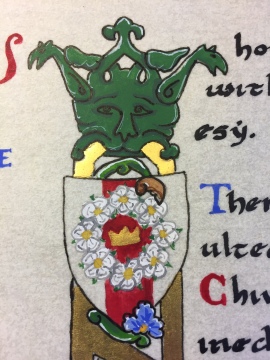
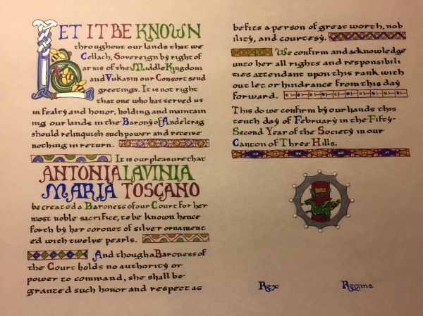
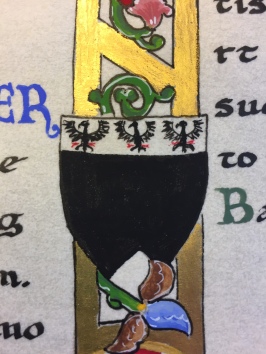
The center divider is based on a large initial I, though here I used it just as a dividing element. In the original manuscript, the divisions within the letter are filled with foliate and figural elements. For my scroll, I replaced these with escutcheon shapes (shields) about an inch and a half high that I filled with a variety of devices that fit the recipient and his history. At the top, the general device of the queen of the Middle kingdom – a crown surrounded by a wreath of white roses.
Next, the device of Queen Kateryn who was on the throne at the time of the elevation:

Then, the device typically used by the Queen’s Champion, a sword surmounted by a white rose and a crown above it:

And finally, the personal device of the award recipient. I’m especially happy with the tiny eagles at the top of this shield. It took me a little practice to work them out but ultimately I found that simpler was better and drew them with a brush, starting with a stick figure and filling out the wings and body with some small brushstrokes to create the basic shape. These are so tiny they didn’t really need a lot of detail!
At the very bottom of the divider, I painted in the seal of the Middle Kingdom that is often used on scrolls. This is the first time I’ve painted the seal like this, but a few other scribes have done it and so I decided to give it a shot. The circular form here is about an inch and a half wide.

The materials used for this scroll are 100% modern. I’ll freely admit that I’m not really gung-ho about going to period methods when the modern materials are just so darned convenient! The base is heavyweight Pergamenata in the “natural” color with Winsor & Newton gouache for paint. The ink used for the main text is Calli calligraphy ink in black.
For gold I used two different methods. The shinier gold used in the center divider is 23 karat gold leaf applied to an adhesive base of Kolner Miniatum ink (this is a variation on Kolner’s gold adhesive that is thin enough to apply with a dip pen and can be used for flat gilding). The gold for the crowns and around the dragon seal is Holbein Pearl Gold gouache.
Edited to add a picture of the finished product since I realized after publishing that I’d only put the bits and pieces in! So, here it is:
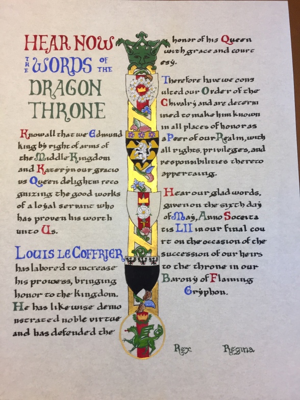 Overall, I’m pretty happy with the way this all turned out. I’m still a little disappointed that I wasn’t able to use a big illuminated letter here, but I”m sure I’ll have plenty of future opportunities for those. Most importantly, the friend who commissioned the scroll was really pleased with it, and the recipient loved it as well!
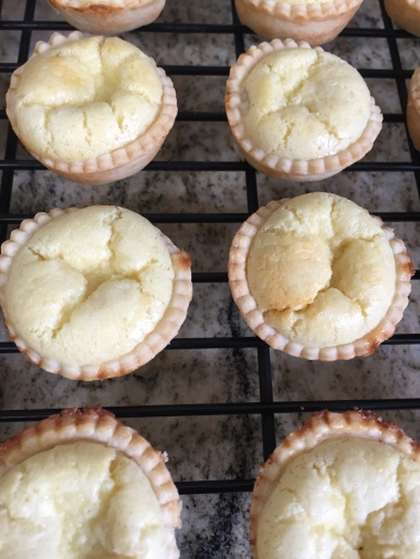
Tiny Tarts
Last weekend I attended the Middle Kingdom Cooks’ Symposium in the Barony of Cynnabar. This event is held every other year and travels from group to group around the kingdom. The focus of the event is, of course, medieval cooking, and this year the list of classes included everything from the place of tea in Japanese society to cooking over an outdoor fire to carving meat in the manner used in the 14th century.
At the end of the day is typically a potluck feast in which participants are encouraged to bring a dish appropriate to the SCA period (or just something really tasty). We had a great array of foods this year – all kinds of bread, salads, meats, grain dishes, several soups, vegetables, and many desserts.
I’m a fan of desserts, so I had a look through one of the great resources of 16th century German cooking, the Cookbook of Sabina Welserin, which dates to 1553 and has a list of nearly 200 recipes including everything from boar’s head to apple pie.
As I looked through the recipes, I started to feel some interest in the various almond tarts that are listed (six different versions) and I decided to give one of these a try for the potluck. After looking through the different versions and considering what sounded most appealing, I settled on recipe 76: “Shell the almonds, pound them very small and strain them through a copper sieve. Take cream or sweet milk, take five or six egg yolks and let it bake. If you would like, you can mix rose water in with it, or else not.”
Even though this particular recipe doesn’t specify putting the almond mixture into a crust, I decided to do this to make it more tart-like and easier to serve. I used a mini-muffin pan to make tiny tarts that could be small servings for the potluck. This was easier to serve than a larger tart that would have to be cut into slices.
I cheated a bit by using commercial pie crust since I didn’t want to mess around with making my own, and cut the crust with a biscuit cutter that’s about 2.5 inches across, fitting each circle into one of the mini-muffin spaces.
 The filling mixture consisted of:
1/2 cup heavy cream
1/2 cup 2% milk
1 cup almond meal
2 large eggs
1 tablespoon sugar
1/8 teaspoon almond extract
I used almond meal partly because I had it on hand and it was already ground, and partly because the recipe states to pound the almonds “very small” and then put them through a sieve. This suggested to me that the end result was meant to be very fine, like the almond meal I used. This mixture made enough for about 30 little tarts, filling each shell almost to the top. The tarts were baked at 400 degrees for about 20 minutes, until the filling had puffed and set and was lightly golden brown on top.
The end result was a soft, pillowy filling that one taster even mistook for mashed potato! This was probably related to the finely ground almonds since there wasn’t a lot of “nut” texture to the finished tarts.
As I worked on these and tasted them when they were done, I spent some time thinking about what this dish was really meant to be. While our modern definition of a “tart” is usually something meant for dessert, I suspect that many of these tarts were meant to be served as part of the main course of a meal rather than a sweet dish at the end. The recipes don’t all involve sugar, though several do list rose water (which I omitted because I don’t care for the flavor). As noted above, several of the recipes do not call for a crust, also suggesting that this may have been served more as a pudding than a tart in the modern sense of the word.
Overall, the recipe was simple – one of the joys of Welserin’s book is that the recipes are pretty straightforward – and tasty. This is something that could be made sweet or savory, depending on how it’s intended to be served, though if I were making it again as a dessert, I would add more sugar and increase the amount of almond extract (though perhaps using freshly ground almonds would give more of that “almond” flavor).
Pick-ing Up
The last couple of weeks I’ve been working on some more pick up weaving to make some bookmarks for a largesse challenge held at the Middle Kingdom Coronation. This is an opportunity for artisans and craftspeople to showcase their work and also provide a stash of small items that the King and Queen can give out as small gifts throughout their reign.
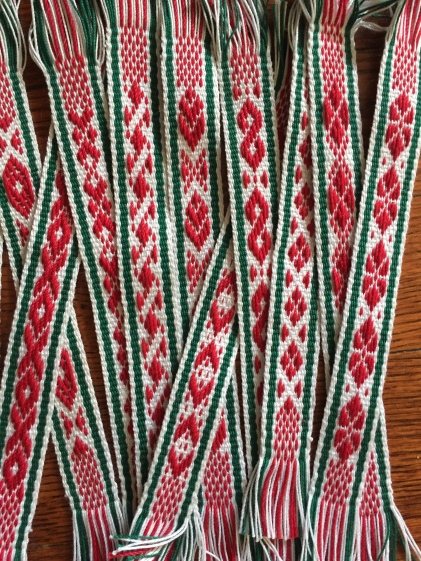
I started with the patterns from Anne Dixon’s book, The Weaver’s Inkle Pattern Directory and built from there. Some of the patterns I adapted from ones that come later in the book, since I set up this warp with only seven pattern threads. One warp of my loom produced 11 bookmarks about 7 inches long each (plus fringe). Since the challenge was “Dirty Dozen or Lucky Seven” (submit either 13 or 7 of an item) I did a second warp and made 10 more bookmarks for a total of 21.

I learned a lot in doing these patterns, especially how important it is to space the motifs correctly. A couple of the early patterns I charted have some odd points in them because I didn’t realize yet that it was important to pay attention to whether the odd or even pattern threads were being lifted to the top of the weaving.
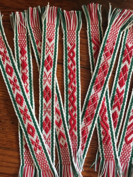
Overall, I’m pretty happy with the way these turned out and now I have some better experience with this technique. I’ve spent way too much time on Pinterest as well, collecting more patterns. This is another technique that appeals to my pattern-loving mind, so it’s satisfying to see things develop as they should.
More Blue Weaving
So I’ve got a lot of blue thread I’m trying to use up, which is why this project uses the same blue as the previous one.
This technique is one I’ve had percolating for the last couple of years but haven’t really tried. I took a class at Pennsic last year and gave it a shot but the process didn’t really work out, though I kept thinking about it. Finally, I got some heavier thread and watched a great tutorial video from The Compleatly Dressed Anachronist and presto – pick-up inkle weaving!
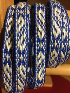 The finished length is just under half an inch wide and a few inches more than 8 feet long. This is another “pay attention” weaving method, though you do pick up the rhythm after a while.
Overall, I like the way this turned out, though I would leave a little more space between the pick-up motif and the border on future projects. Maybe just one more row of weaving on each side would set the design off a little more.
Of course, one of our cats – Bouncer – felt the need to investigate the new thing in her space. She always has to touch everything!

Pennsic Produce
Pennsic Produce used to be the name of the small fresh market that the Cooper’s Lake Campground ran in the main merchant area. You could get fresh fruit and vegetables and a few baked goods, which was always nice. A few years ago, the campground built a new facility that new serves as the location for many kingdom courts and other activities like the A&S Display, and also repurposed the old “Barn” structure into the Penn Market, which sells a much wider array of fresh fruit and veg as well as meats, cheeses, freshly baked goods (mmm, pepperoni and cheese rolls) and a wide variety of camping supplies.
That being said, here are two Pennsic-related projects, one from before Pennsic and one from just after.
First, the scroll I did for Middle Kingdom court – and Order of the Willow, given for accomplishment in the arts. At some point before Pennsic, I stumbled on the website for the library of Trinity College, Cambridge. Scribes, beware – this is a tremendous rabbit hole! Happily, the library has digitized about 650 manuscripts from their collection, so there’s a lot to look at. I spent a little too much time over a week or so clipping illuminated letters from the Canterbury Psalter, a mid-12th century manuscript produced at Christ Church, Canterbury. There’s a wide selection of the alphabet here, full of lovely colors and wonderful regular patterns.
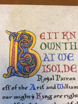
For this scroll, I used a letter B as the main initial, with large colored capitals for the first few lines and then also later in the text for the recipient’s name. I also used smaller colored capitals for many sentences, a common 12th century technique.
I’m pretty happy with the way this all turned out, though I need to be careful with my white lining, as usual. While the Willow is not insignificant, for a more “advanced” award, I might also use gold leaf instead of gouache for the gold elements.
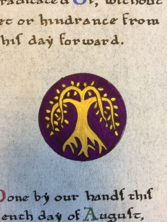
The willow device also turned out quite well and makes a dramatic contrast with the other colors of the lettering around it.
I filled in the lower part of the scroll with a simple border device also found in other 12th century examples, this one from MS Egerton 608 at the British Library.
Several people who saw the scroll when it was awarded spoke to me very kindly afterward and complemented my work, which is always nice to hear!
While at Pennsic, I had good intentions for several classes I thought of taking. I made it to several of them, including a class on the Japanese art of temari – small thread-wrapped balls that have become a traditional New Year’s gift. While we didn’t make it quite through making one of the balls in the class, there’s plenty of information available online and I was able to complete my sample at home.
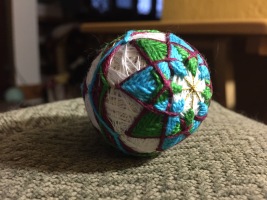 This ball is based on a smooth styrofoam core that’s about 2″ in diameter. I think the perle cotton I used for the embroidered design is perhaps a little too bulky for this size ball, but it still turned out rather well for a first attempt. I could certainly tell which half of the design I did first – the second effort came out a lot tighter and more precise than the first!
Of course, this is another rabbit hole craft to fall down! There are a great many temari patterns out there, and lots of beautiful color combinations to try, so I may experiment with a few more of these. I have lots of thread around and styrofoam balls aren’t that expensive!

