A Big Deal Scroll
Back in May I got a call from a friend asking if I’d be able to do something I hadn’t yet done in the SCA – make a peerage scroll. I was a little surprised and had to say that I couldn’t take the commission right away because it was only a couple of weeks before the event where the elevation was to take place and my modern workload didn’t leave me the time to work on a major scroll like this.
Happily, this wasn’t an issue – many peers commission their scrolls after elevation – and I was able to do the job after the event had actually taken place.
After some time (and Pennsic) went by, I set myself the deadline of Grand Day of Tournaments to have the scroll completed. I had hoped that the king who was on the throne at the time of the elevation would be there to sign it, but that didn’t work out.
So, this is a knighting scroll, my first ever! The recipient uses a 12th century persona, and conveniently I had recently been looking at the initial letters from a great manuscript of that era, in the collection of the library of Trinity College, Cambridge.
The manuscript is known as the Canterbury Psalter and dates to about 1150. It comes from Christ Church, Canterbury and is made up of 285 pages, written front and back on vellum.
Many of the pages have large, colorful illustrations done in red, green, and blue inks while others are decorated with large illuminated letters among the blocks of text with smaller letters done in gold to start each sentence. When I found this manuscript over the summer, I spent an inordinate amount of time clipping images of the letters to save for myself. They’re bright and colorful, and the simple and yet decorative forms have a lot of appeal for me!
I also used some inspiration from another 12th century manuscript, the Winchester Bible, from Winchester Cathedral. This work also has some elaborately illuminated initials, but also has many pages that begin with with a section of text written in brightly colored lettering in red, blue, and green (this color combination seems to be a 12th century theme). Starting off a scroll with these bold letters really makes the text pop, and I’ve done a couple of previous works using this style (Border War 2017 and Pennsic 2017)
My initial plan was to use one of the initials from the Canterbury Psalter to begin the text, with some lines of the colored lettering as the introduction. I wanted to divide the text into two columns, with a center illumination inspired by a form from another 12th century Trinity Library manuscript, the S. Hieronymi Quaedam.
Unfortunately, even on an 11×14″ sheet of paper, this didn’t quite work out. With the center dividing element, the area left for text on each side was only about three and a half inches wide, and that just wasn’t going to leave enough space for a big illuminated capital to fit in comfortably. So, what I ended up doing was leaving out the major capital altogether and focusing on the center divider as the main illumination.
 I started off the text with the boldly colored large capitals, using one of my favorite introductory phrases. While the letters I used are less angular than those of the Winchester Bible, they fit the style of the 12th century and they’re fun to do!
The rest of the text is written with a dip pen in the Early Gothic hand common to the 11th and 12th centuries. Here I used the exemplar from Marc Drogin’s Medieval Calligraphy, a common resource for SCA scribes.
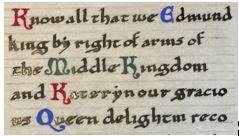
I also followed the medieval examples somewhat in using a colored initial to start each sentence of the text. Instead of gold, I kept going with the red-blue-green color scheme.
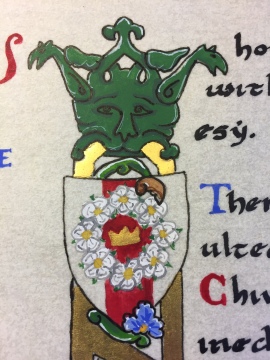
The center divider is based on a large initial I, though here I used it just as a dividing element. In the original manuscript, the divisions within the letter are filled with foliate and figural elements. For my scroll, I replaced these with escutcheon shapes (shields) about an inch and a half high that I filled with a variety of devices that fit the recipient and his history. At the top, the general device of the queen of the Middle kingdom – a crown surrounded by a wreath of white roses.
Next, the device of Queen Kateryn who was on the throne at the time of the elevation:

Then, the device typically used by the Queen’s Champion, a sword surmounted by a white rose and a crown above it:

And finally, the personal device of the award recipient. I’m especially happy with the tiny eagles at the top of this shield. It took me a little practice to work them out but ultimately I found that simpler was better and drew them with a brush, starting with a stick figure and filling out the wings and body with some small brushstrokes to create the basic shape. These are so tiny they didn’t really need a lot of detail!
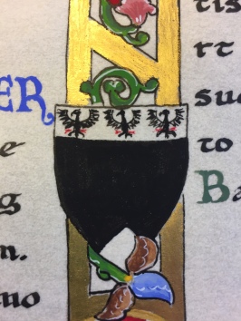
At the very bottom of the divider, I painted in the seal of the Middle Kingdom that is often used on scrolls. This is the first time I’ve painted the seal like this, but a few other scribes have done it and so I decided to give it a shot. The circular form here is about an inch and a half wide.

The materials used for this scroll are 100% modern. I’ll freely admit that I’m not really gung-ho about going to period methods when the modern materials are just so darned convenient! The base is heavyweight Pergamenata in the “natural” color with Winsor & Newton gouache for paint. The ink used for the main text is Calli calligraphy ink in black.
For gold I used two different methods. The shinier gold used in the center divider is 23 karat gold leaf applied to an adhesive base of Kolner Miniatum ink (this is a variation on Kolner’s gold adhesive that is thin enough to apply with a dip pen and can be used for flat gilding). The gold for the crowns and around the dragon seal is Holbein Pearl Gold gouache.
Edited to add a picture of the finished product since I realized after publishing that I’d only put the bits and pieces in! So, here it is:
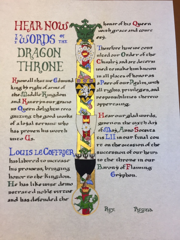 Overall, I’m pretty happy with the way this all turned out. I’m still a little disappointed that I wasn’t able to use a big illuminated letter here, but I”m sure I’ll have plenty of future opportunities for those. Most importantly, the friend who commissioned the scroll was really pleased with it, and the recipient loved it as well!

