Last Minute Project
I’m leaving for Pennsic tomorrow, and while I didn’t make any new clothes this year, I have been working on finishing up a tablet weaving project that’s been on the loom since January. I was determined to get this done and off the loom before I left, so this afternoon I did the last few repeats of the pattern.
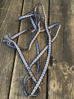
This is the first of the three “S” patterns from Applesies and Fox Noses, based on a fragment of a woven band from an archaeological find dating to the Iron Age in Finland. This is a rather broad period from about 500BC to 1150AD, and unfortunately the book doesn’t give specifics as to the estimated date of the actual find (some further research to be done when I’m not also packing).
 The pattern here is deceptively simple. While the finished product isn’t complicated, getting there requires a fair amount of attention since this is not a basic X-turns forward/ X-turns back pattern. Instead, different packs of cards turn forward or back on each pick every four or five picks so keeping count of each turn of the cards is important! I also reversed the turning of the border cards every three repeats of the pattern (6 “S” shapes) to prevent the buildup of too much twist.
The finished band is 101″ long (plus fringe) and 3/8″ wide – very delicate, and I think this would look very nice done in silk or fine wool. The bold color contrast is striking!
The Milk Jug Bag 2.0
A couple of years ago I made a post about this old Girl Scout craft, the ditty bag or camp carrier made from an empty milk jug. When I did these in Girl Scouts we used a gallon jug, and that’s what I used for my contemporary project as well.
That carrier lasted for four years, which I think is pretty good considering that today’s plastic jugs are a lot lighter than those of the past. Still, since we don’t cram as much into ours as I used to in my Girl Scout days, the gallon jug seemed to be a little big for our needs.
So when we got home from Pennsic last year, I saved a half-gallon jug to use for a smaller version and as I’m prepping for this year’s trip I finally got around to finishing the project.

The biggest thing I learned from this new project is one of those “life hack” things the internet likes to yell about these days. When it came to pulling the label stickers off of the jug, I was left with a lot of adhesive residue that just didn’t want to come off. Soap and super-hot water? Nope. Acetone? Kind of, but not super effective. So I did some Google business and found a couple of suggestions. First, rubbing alcohol. Again, this produced a “sort of” result, but didn’t really work well. The big winner? Vegetable oil! That’s right, plain old canola oil from the bottle on my pantry shelf. Drizzle some on the adhesive, cover with a paper towel and let sit for 10-15 minutes and the adhesive rubs right off. It was incredible! Now you know…
Originally, I had planned to cut down the fabric top of my original bag to make it fit the  half-gallon jug. However, I found this would have meant cutting down a LOT (like almost half) and I didn’t really want to fuss around with it that much. So what I ended up doing was marking the fabric at regular intervals and tacking it in place at the corners of the jug and midway along each side. Then, as I was stitching the fabric in place, I just made a couple of small pleats across each side to take up the extra fabric. This way, I still have a big opening at the top to reach into and a smaller container at the bottom to carry my shower supplies. Project completed!
Scribal Friday
Now that the end of summer term is approaching, I have a little bit of a lull in the rounds of frantic grading. I’ve actually been doing a fair amount of scribal work lately, between a couple of events and a challenge organized by a fellow scribe in the Barony of Cynnabar. As a group, we’re working on doing a set of blanks with all of the letters of the alphabet! I’m sure we’ll hear the cursing of the scribes to come when someone gets a blank with an X on it…
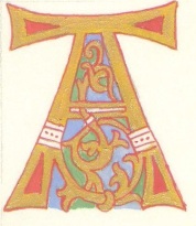 In May, I started with the letter A. I’d already had this letter penciled in for a blank earlier in the year that had stalled once work got busy, so I had a little bit of a head start. This letter is done in the 9th-10th century Ottonian style. It’s fun to do the gold, and I’m getting better at doing fine lines with a brush. I rather like the red outlining on this style. You can also see the similarity to the later Italian White Vine Style of illumination here as well.
 Then, for an event in June (I wanted to get an early start), I made a full scroll for someone in my local group. Since the person’s name links him with the town of Chartres, I found a manuscript from that cathedral and used a letter O for the beginning of the scroll. The Dragon’s Heart device fit neatly inside the letter, and I’m really happy with the way the shading of the scales turned out. It’s always tempting to try to make this “perfect” but more often the little random touches of dark and light colors give a better effect. The outlining here is all done with Micron pens – a modern touch, but something that gives a nice clean line.
 I also really like the bold, colored capitals for the first few lines here. This is a technique used frequently in 12th century manuscripts, and they were a lot of fun to do! It’s nice to not have to be so precise sometimes, and tucking the two Ls together helps save a little space.
My second blank for the alphabet challenge was a letter U, done in an Early Medieval style common to the monasteries of the British Isles. For this one, I also started with an introductory line since I think this gives a more cohesive look to the scroll overall. Still working on getting the rubrication (the tiny red dots) more even, though of course the exemplars aren’t perfect either!

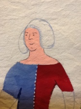
 Finally, for another event this past weekend, I used a blank I had done way back in 2014 (and maybe already posted somewhere here already). This is one of the few blanks I’ve done with an award device already on it. Usually I only include the device if I’m making a scroll for an assignment, but this was going into a competition where one of the entries had to be in support of martial activities. The Dragon’s Barb is given for excellence and service within the archery community. I realized as I was doing the lettering that it was going to end up looking like the archers in the castle were shooting at the names of the king and queen. If I do one like this again, I’ll have to make sure they’re aiming somewhere else!
Weaving Wednesday
As promised a mere two months ago, here is a post on some weaving I’ve been doing!
Some of these bands go back to last year, and I have a piece on my loom that I haven’t touched for a couple of months – need to get back to that – and one piece needs to be attached to the Hubs’ fighting jacket before he wears it out and needs a new one again.
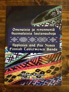
All but one of these is from the Applesies and Fox Noses book, a great little tablet weaving resource that was quite the rage in the tablet weaving community a couple of years ago. I’ve been slowly working my way through the patterns, though I skipped the first one since four forward-four back patterns are pretty common. All of these bands are done with size 10 cotton crochet thread.
Pattern 2 is named “Little Chicken Toes with Bird’s Eyes” (all of the patterns in this book have inventive names  that probably mean something humorous in Finnish). I used Middle Kingdom colors for this, thinking it might go into a largesse basket at some point. It’s about an inch wide and a little less than three yards long.
This pattern is an eight forward-eight back turning sequence and while the border cards for the patterns in this book are supposed to go continually forward, I kept the sequence there as well since I didn’t want to have to deal with a lot of built up twist in those threads.
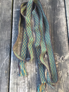
Pattern 3 is called “Small Applesies”. For this band I used some cotton thread I had ordered from Halcyon Yarn several years back with different projects in mind. While the brown, gold, and teal combination may be somewhat modern, it did turn out beautifully. The band is about an inch and a half wide.
This pattern follows a five foward-five back turning and there are a couple of small mistakes in the band where I missed a turn. An odd number like this is a little strange – most patterns use even numbers of turns – and I think there are a couple of places where I reversed the pattern at four turns instead of five.
 Pattern 4 – “Bee Feet”. The example in the book for this pattern is done with only two colors, but I decided to try three. This one required a little re-threading since I didn’t have the pattern charted correctly to begin with – all part of the learning process! This band is a little less than an inch wide.
This design is where things start to get a little more complex, and there are places where the pack of cards is split into groups that turn differently. Some rows turn all forward, some all back, and some have the split groups turning forward or back on the same row. This makes for some exciting weaving and definitely means you have to pay attention to what you’re doing.

Finally, a pattern not from the book is this simple design I made for trim using the Hubs’ device of gold mascles (diamonds with an open center) on red. It’s about an inch and three-quarters wide and is meant to go on the hem of the fighting jacket we made him last year, though it hasn’t quite made it there yet!
The current warp on the loom is Pattern 5 from Applesies, “The S Sign”. This is the first of three versions of this pattern included in the book, all of which are based on historical fragments from the Iron Age. No pics yet, since it’s a work in progress!
Once More Around
Back again after an over-long absence. Work has been exceptionally busy the past several months and, while my bank account is happy, I haven’t had much free time.
Nonetheless, here’s a scribal update from the first couple of events for 2017.
 For 12th Night in January, I did a special scroll for the Baronesses of Andelcrag. This writ isn’t a traditional SCA award, but gives some special but limited privileges to an individual known for his special humor and fun-loving qualities.
 I also did an award for the royal court that was inspired by an 11th century runestone from the island of Gotland. The recipient is working on a persona from this region, and the less complex style of the artwork made this a relatively quick and easy work to do. The hardest part was working out the text so the runes would fit into the space available!
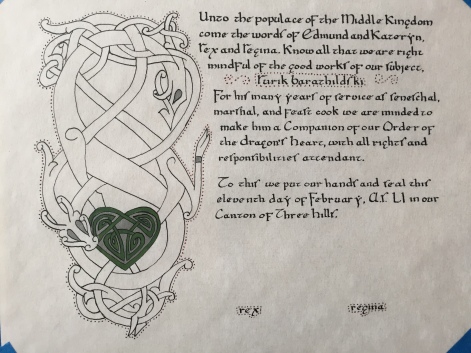 Finally, for Val Day in February I was assigned a Dragon’s Heart – the same award I did last year. These are always fun to do and I look for forms that are really unique. This design is inspired by a tattoo artist’s work based on Norse forms, and you can see the similarity to the runestone I used for the award above. Here also, while the design seems simple, this is a case where less is definitely more and the bold outline really lets the form stand out in contrast to the text and the more colorful heart within the design.
Next up, some weaving updates!
Scribal Extravaganza
Well, it’s been a while and this has been nagging at me for quite some time. So, since I don’t feel like working on actual work for a change, here’s a post!
While there haven’t been many local courts this summer, I have managed to do a fair amount of scribal work. Baroness Hannah, a friend of mine in Cynnabar, has been working on a scribal challenge – getting the scribes of the group to make as many scroll blanks as possible to donate to the kingdom. To encourage this, she’s hosted several workdays at her house where scribes can get together to work and share ideas and comradeship.
I was able to attend one of the workdays back in July and had a fun time (how could I not?) hanging out with friends and fellow scribes.
 I completed one blank with a large capital L and some whitework of the style done in the 14th century. I also shared one of my scribal “cheats” – a page I’d made with a bunch of whitework patterns collected from a variety of manuscript sources. Having them all in one place makes it easy to pick patterns to put on a scroll, rather than having to take the time to leaf through a book to find different designs.
Even though the whitework is not as neat as I might like, the overall effect is nice and the bright colors always stand out.
 I also started a second blank in a style that would be appropriate for and early medieval persona with a border design based on some Celtic carving. Though I got the border finished, I thought the rest of the scroll looked a little plain, so I brought it home with me to add a large capital to start things off.
I kind of like the simplicity of this one, with just green and gold colors. The gold here (and on all of these scrolls) is done with Holbein “pearl gold” gouache, which makes a decent substitute for shell gold (finely ground gold in a pellet that can be used like paint) but is relatively quick and easy to use. I always put an undercoat of yellow or yellow ochre paint down before applying the gold gouache. This helps give better coverage since I don’t have to apply as much of the gold paint to get a good look.
With that, we were off to Pennsic for two weeks and then there were only two weeks afterward for me to get ready to start the fall semester, so things kind of hit a lag for a while. However, at a local event last weekend, there was a “Five Hour Challenge” competition. Entrants were given five hours to work on a project of their choosing and at the end of the time judging was done on the scope of the project, success of completion, and quality of work. I decided that bringing my scribal supplies along would give me something to do throughout the day and I could see how many blanks I could do in that time. The answer is three!
 First I made another scroll inspired by Celtic illuminated manuscript work, using a large illuminated letter and completing the top line with enlarged text surrounded by rubrication (tiny red dots) that are typical of this style.
As is often the case, I’m not really satisfied with the way the rubrication turned out. I always have a hard time getting the dots evenly spaced and regular in size and shape.
Still, I happened on a blog entry from the British Library the other day on this exact topic that has some really great closeup images of a page from the 7th century Lindisfarne Gospel. I was amazed to see that the historic dots aren’t even either!
So I feel a little better about my dots now, but I think I still need to work on getting them a little more consistent.
 Then, I made a scroll with an initial done in the style of Ottonian manuscripts from about the 10th century. The Ottonian style is kind of a combination of some leftover Celtic interlace bits and a more vegetal, less geometric style. What’s also interesting about these letters is their typically red details and outline, which stands out from the more standard black or dark brown used in most other forms.
The gold here should really be gold leaf rather than paint. You can see the shine of real gold on the historic manuscripts, but for this purpose and given the short amount of time I had to work, the gold paint fit the bill.
This is the scroll I’m most happy with of the three I made. I was able to use a fine liner brush to fill in the red details and especially the overall outline of the letter and I think really achieved the look of the original forms. I may add a small border to the opposite corner of this scroll, but it’s on a smaller piece of paper (about 6×9″) so I don’t want to limit the space for calligraphy too much.
 Finally, I made a blank in the style known as Italian white vine, which was popular in Italy in the 15th century. This style is always fun and is actually relatively simple – there’s no shading or complicated patterning, just large block areas of color.
What’s fun about this style is again the dots – white dots on the blue and red areas and gold dots on the green areas. Here again the gold of the letter should be done in gold leaf, but for practical purposes the gold paint works well.
I also used another scribal cheat on this one and used Micron pens in black and brown for the outlines. These fine point pens are a quick and easy way to outline when you don’t want to mess with a tiny nib.
So now I’m all stocked up and ready for some future courts!
Meanwhile, I did do one complete scroll for an event in the region. While I had kind of hoped for something I could apply to one of my existing blanks, I ended up with an assignment for a Japanese persona. Still, I like doing these scrolls that are outside the standard European model. It’s a nice opportunity to break out of the regular forms.
I had a strip of Pergamenata about 6×37″ left over from cutting down a large sheet. It’s an odd size, but this kind of thing often works for a non-traditional scroll like this since I could do something in the style of a Japanese hand scroll. After doing a little research on different forms in the recipient’s time period, I also discovered that her name translates to “maple” and so settled on a design of a maple branch extending along the length of the scroll with a block of text at one end.
 Here, the scroll is still taped to my work table in the basement (hence the odd shadows). The ink and paint I used for this were very liquid, and I didn’t want the Perg to buckle from the moisture.
The text is written from right to left and vertically, as with traditional Japanese calligraphy. I used a faux hand with the English alphabet altered to emulate the look of Japanese calligraphy. While the text blocks here are a bit larger than you might find on a traditional hand scroll, I’m happy with the way the blocks of text balance out that end of the scroll against the more sparse look but intense color of the branch and leaves across the rest of the space.
Unfortunately, the intended recipient wasn’t at the event, and I don’t know if it’s been delivered to her yet. Still, I was really gratified at the gasp that came from the audience when it was displayed in court. It’s always nice to get a reaction like that!
Armpits Ahoy!
And other fabric goodness. So, yes, long time no post. Busy person is busy and so on and so forth.
But, summer is here now and I have (a little) more free time, especially since a number of events we might normally go to have been put on hiatus due to the SCA 50 Year event going on this month. We are not going because of work obligations, but the upside is this gives us about four free weekends to work on various projects that need doing.
 So this weekend, we both did a bunch of various project work. The Hubs spent a considerable amount of time in the basement, working on pottery projects and did a glaze firing in the kiln on Sunday. He was able to deliver a commission of a blue bowl to his chiropractor today, in exchange for a couple of free adjustments.
There was also an assortment of mugs and cups in  this load, as well as some other commissioned bowls. I like the way these striped ones turned out.
I spent most of Saturday upstairs in the sewing room, making some alterations to my various underdresses. having become a person of a certain stage in life (ahem) and also having done a push-up challenge a while ago AND doing yoga a couple of times a week pretty consistently for the last 18 months means that my upper arms have become a little more substantial than they used to be. This means that most of my more fitted underdresses had become a little snug in that area and required some adjustment.
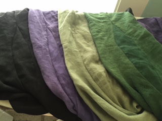 The solution to this problem was to open the side seam from just below the bicep into the armpit area and insert a gusset of sorts. It took me a couple of tries to get the shape and size of the added piece right, but after some repeated cutting, sewing, and ripping out again (and maybe some swearing and only a little blood, none of which got on the clothes) I found the right form. It’s amazing how much the fabric of some of the dresses has faded! The dark green one is the worst, but you don’t really notice it unless there’s some less-faded fabric to compare, and I doubt I’ll be spending a lot of time waving my arms around so the gusset won’t really be that noticeable.
I also made an adjustment to my dragon-appliqued Norse apron dress, which also needed a little expansion around the upper opening. I added a small gore in the center back seam to give myself a little more room. In the process, I noticed the giant holes that were caused by attaching my brooches to the lightweight linen. So I decided to make an adjustment there as well by adding some small fabric loops at the top edge of the dress. This way I can put the pins through the loops instead of actually through the fabric and the weight of the brooches won’t drag holes in the fabric.
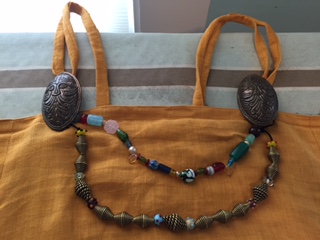 After that, I decided to take off the shoulder straps I’d originally made and replace them with longer loops as well. This is a method that has been documented in a number of Norse grave finds, where small bits of fabric are sometimes found still within the brooches. Again this seems like a sensible solution because it saves the fabric from being pierced over and over again and having heavy pins and strings of beads hanging from it.
While I was at it, I also used some fine crochet thread to make a thin lucet cord so I could restring the coiled bronze beads the Hubs acquired from Duke Eikbrandr a couple of years ago (I think when I originally made this dress). I’ve had them strung on a couple of strands of crochet thread since then because it was what I had on hand at the time, but that string finally wore through a couple of weeks ago. While restringing I also added a few small glass beads to the strand to set off the special twisted beads. This made the bronze strand a little longer than it used to be, so I need to make a third strand to go in between. Luckily, I have some beads on hand…
There! A post after a long absence. Luckily, there’s more to come, since I have other projects in the works – stay tuned!
Three Scrolls
Continuing my updates, here are the scrolls I’ve been working on over the last few months. We’ve had a busy time here, with 12th Night, Val Day, and Terpsichore at the Tower all having royalty in attendance, so there’s been a lot of scribal work to do.
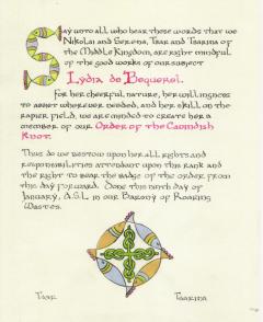
For 12th Night I was assigned a Cavendish Knot, a fencing award, for a lady who goes by the nickname of Fish. I did a little searching and found a cool manuscript from the 7th century where many of the illuminated capitals are actually made up of simplified fish shapes! I used an example of a capital S from the manuscript and the followed the same pattern to frame the award’s device at the bottom. The recipient was very excited and found me just after court to say thank you, which is always nice to hear.

Val Day brought me a Dragon’s Heart, which is a pretty significant award, so I like to do something a little fancier for these. I decided on an Italian White Vine design – a 15th century style that originated in Italy (go figure) and became popular throughout Europe. It’s been a while since I’ve done one of these and I was reminded how enjoyable the style is. The nice thing is that, while the design can be complex, the painting is not – basically solid areas of color filling in the spaces between the vines, with no shading required. Right up my alley!

Finally, there was a short court list for Terpsichore (less than a month after Val Day) and I was assigned a Purple Fret for a person who is very active in the music and dance community. I looked for some appropriate medieval musical notation and found a 14th century manuscript that included the notation for a popular song called “Sumer is Icumen In” (basically Summer is Coming) and used that as the basis for my scroll. Like the original, I alternated lines of musical notation with text and had alternating lines of black and red lettering.
I like the freehand capitals I devised for this one, as well as the highlight details on the fret. Little touches like the white detail really make the form stand out and give a more finished look.
Now we should have some time off from scribal work since there isn’t a court scheduled in our area for quite a while. The regional Arts and Sciences Fair is coming up, though, and I have a project in the works for that. More to come!
Mostly March
The end of February and beginning of March have brought some adventurous weather, with about a foot of snow falling last week (which melted over the weekend) and then another 8 inches this week (which should all be gone by early next week). Hooray for March!
 My latest weaving project was a set of tablet-woven bookmarks for each of the baronies of Pentamere. These were displayed as part of the “Dirty Dozen” largesse competition at 12th Night. Because I made 12 bookmarks for each barony, plus 12 for the kingdom, I also qualified for the “over-achiever” category which gained me a prize of some Japanese kumihimo braid made by another lady in the region. I still need to coordinate with her on what I want.
At any rate, the bookmarks were fun to make and got me back into the swing of things with weaving. I haven’t made anything since, but I hope to be a bit more crafty in the coming weeks.
February Fun
This might be the longest I’ve ever gone between posts – almost three months! I’ve been doing things, and I’ve thought about posting but just never gotten around to it. With a little bit of free time this weekend, an update is finally here.
So, when last we left off it was Thanksgiving, which meant end of the semester, lots of grading, and lots of Christmas cookie baking (and consequently not a lot of time for blog posting).
 For this year’s Christmas cookie collection, I made mostly recipes I’ve used before. The four new recipes were, first, a Brown Butter Sugar Cookie from King Arthur Flour. These were supposed to be made with some patterned cookie stamps from KA, but I just made them as star-shaped cutouts.
Next, I was looking for a slice-and-bake or icebox cookie and thinking of something orange, so I found these Orange Pecan Cookies from Taste of Home. Though I apparently forgot to take a picture of the finished cookies, they turned out nicely, with a light orange flavor. It’s funny that Taste of Home doesn’t have a picture with the recipe either!
 Taste of Home also gave me a recipe for Coconut Snowballs. I had some coconut in the freezer to use up and these made a tasty option. The coconut ends up being a little crunchy and chewy at the same time. If I make these again, I might get some coconut extract to add a little extra flavor. These get a second roll in powdered sugar before serving, so they’ll have a more finished look.
 Finally, the best new recipe was one that I think I found on Yahoo in one of their Christmas cookie articles – Striped Icebox Cookies. These were super! Nice crunchy texture from the cornmeal in the cookie dough, and tart, fruity layers of jam filling in between. A little fiddly to make, but a yummy result.
 And here is the finished result – 12 different kinds of cookies packed in their tin. I gave a lot away, as usual – family, friends, neighbors – and also contributed a lot of what I had left to a peerage vigil at 12th Night, so by now they are all gone and we won’t be eating Christmas cookies at Easter this year!